ShopDreamUp AI ArtDreamUp
Deviation Actions


Suggested Deviants


Suggested Collections


You Might Like…


Description
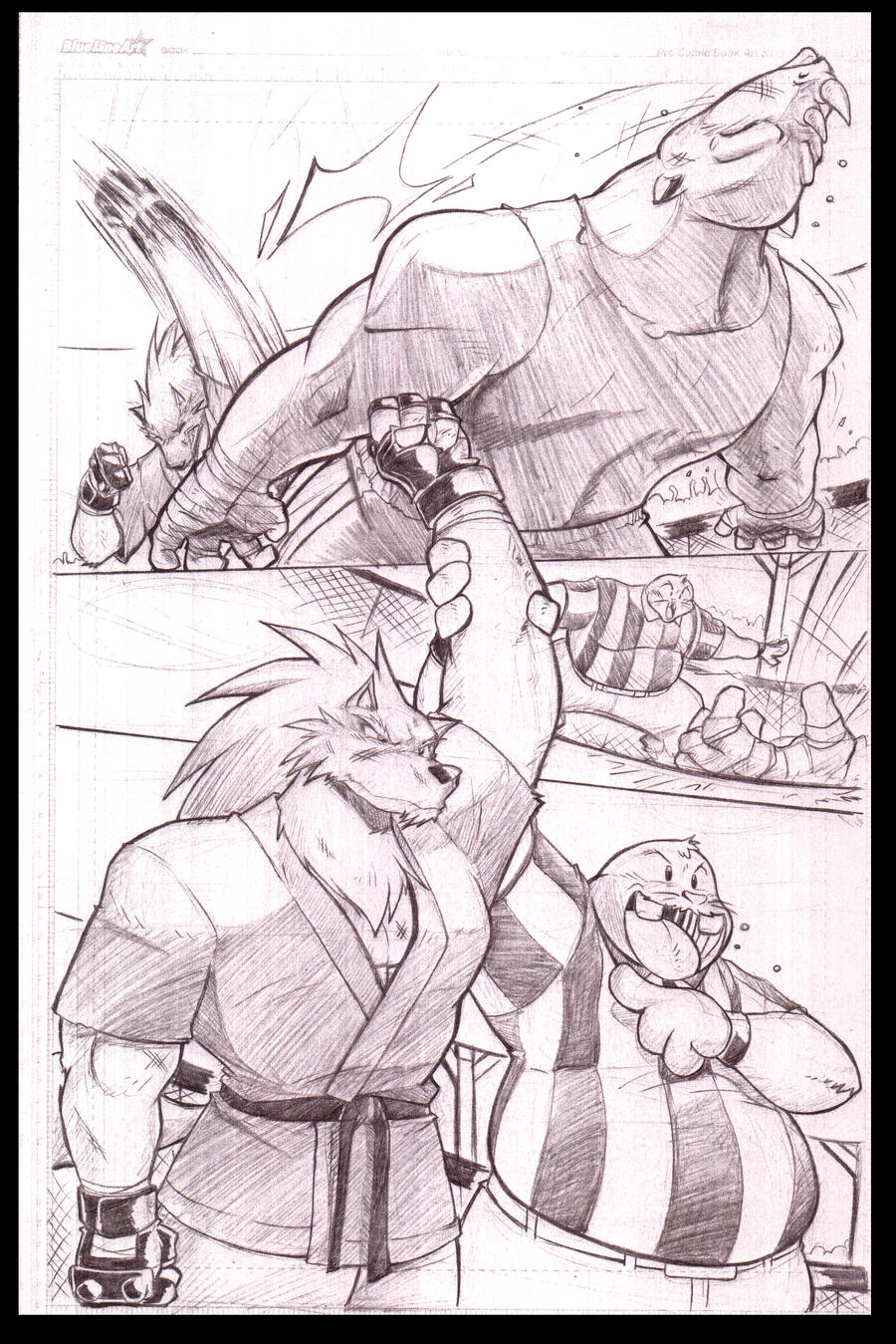
This is one of the Pages that I am doing for the Squeek and Shred story..I was going to go for an all pencilized art ( I was inspired by Adam Warren's Empowered style). I was planning on doing small stories of the characters cause I am not really into doing a longated story. Some stories will have connections to others, but no big long story of the characters will be created just yet.
Wadayathink of the page?
Wadayathink of the page?
Image size
2120x3176px 10.21 MB
© 2009 - 2024 ShoNuff44
Comments105
Join the community to add your comment. Already a deviant? Log In
We get to see so little of your comic pages here on DA that this is a real treat. Glad to see that a lot of artists use the Blue Line Pro paper as well. You just gave them some good advertising.
On to the critique.
The Good - I admire comic artists that can do huge overlapping panels like this and keep that focus and storytelling going so well. Your bottom panel is the dominant part and it intersects each other panel without distracting the reader and makes a good impact and satisfying effect.
The depth and action in the first panel is also very satisfying. I can go on and on about your art style being a very unique blend of anime and other styles that works so well for anthro characters here.
The Bad - My only concern is maybe that second panel. It works very well but it is so small that you almost miss it when the other two are so large and powerful. I'm not sure how it could have been done better though. I almost commented on the amount of space by Shred's head in the last panel but I see you left that for word balloons.
The Ugly - There's nothing ugly about this page. I love to see it when artists put their time into a picture. I'm always trying to cram in at least six panels per page so I rarely achieve a page that creates this kind of effect and level of artistry. I should learn from sample pages like this.